Finding the perfect studio by Quentin Cockburn Esq
All my life I’ve been searching for the perfect studio. As a design professional I’m unemployable. I was once a designer. I used to work with other designers. But I felt alienated. When they all shaved regularly I was unshaven. And then, when I started to shave they started to look unshaved. It’s difficult, designers are all individuals, they express their individuality through design and being different from the common man. That’s why they look the same, dress the same walk and talk the same. They’re a band of brothers.
Still, I’ve learnt a bit from design. I’ve learnt ‘Design-Speak’. It’s a lot like ‘Art-Speak’, but said with much more conviction. Designers HATE ridicule. Why say ‘side by side’, when you can say ‘juxtapose’. Please try it. When you next see two pieces of toast, one on a round plate, the other on a square plate try saying “Juxtaposition”. Designers also like to talk about planning. They designed Docklands so they can talk with some justification about, “Design Issues”. They are obsessed with the ‘inner ring, active frontages, the mesh, the grain of things, urbanism, sustainability and metro-centrism’. Try that – ‘metro-centrism’. And they feel comforted when they talk about modality, catchment and the grid.
But it’s the places where they work that fascinates me. It used to be, back in the 70’s an old garage, decked out to look a cross between Ikea and Aingers Auctions. Then as design kicked off in the 80’s they moved out of improvised environments and into the sort of interiors Stanley Kubrick contrived for 2001. Lots of white. Glass and steel beams. You see all the ‘materiality’, (remember that one?) express a sense of being anchored to the building industry. Though we all know they don’t know much about construction or builders at all. Then to compensate for all the white, they started wearing black. In the late 90’s they tossed out all the aerodyne, scary utilitarianism, for natural timbers, and colour panels to ‘offset’, and juxtapose all the white. And then most recently they began to buy art in big panels. Not the sort of stuff you’d want to live with though, as they will sternly remind you; ‘a studio is not a home’. But as a centre-piece to be admired for its ‘singularity’.
You see that’s a big mistake, designers don’t like their studios to feel ‘lived -in’, they must be stark and utilitarian. They may have shelves full to the brim with books but you wouldn’t want to read them. Bit like George Brandis’s library, impressive for the visual impact and the fact that he may have read one, but a desert for ideas. No Mann, (Thomas or Heinrich), no Elliot, no Bronte, not even any Bryce Courtenay. But a lot of books with pictures, and a predominance of Japanese and European magazines. Designers don’t like local design magazines (unless there is a feature article devoted to them) as they regard quite rightfully, (like manufacturing) that ‘Good Design’ and ‘Australian’ are mutually exclusive. That’s why they drive smart European cars.
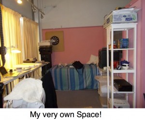
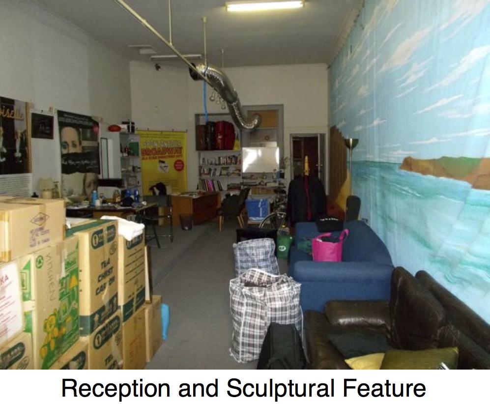
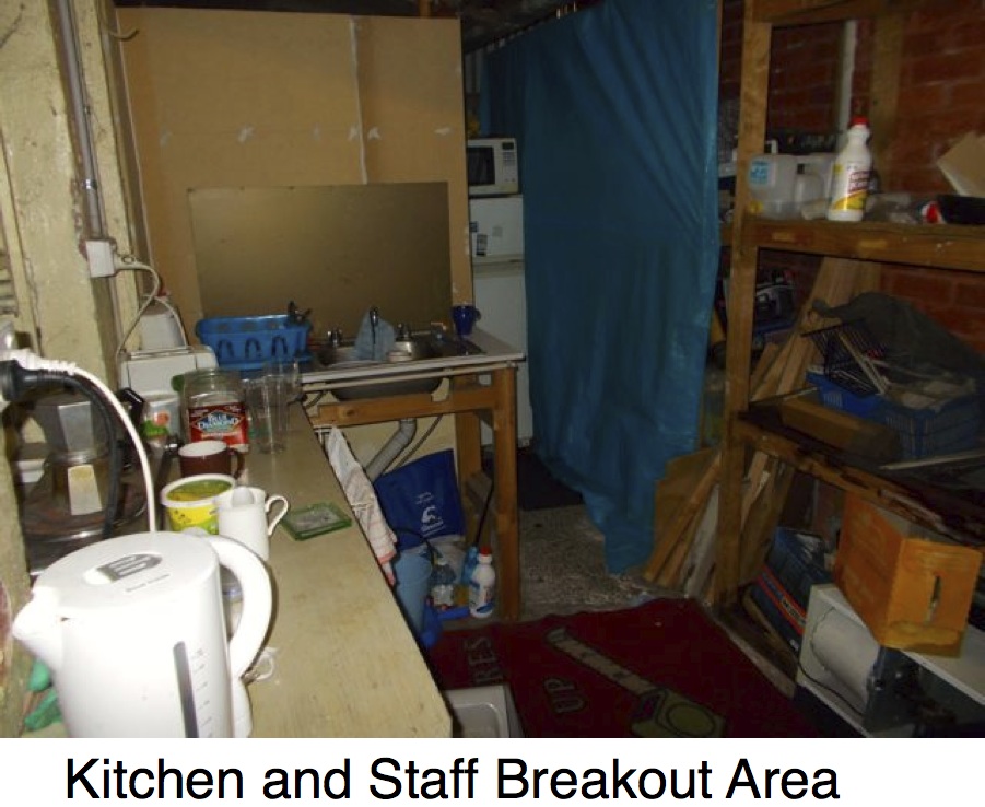
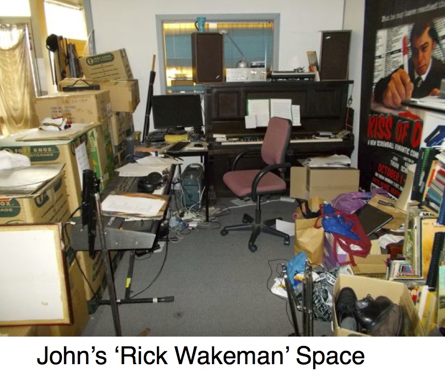
 So contrary to this tradition I’ve left my design life behind. The new studio is indescribably grotty, and feels like a home. It has been sold, so there’s a sense of ephemera. Designers hate ephemera. It was always awkward inviting other designers round to the typical design office, the stain of red on the carpet, the polished boards, with cheese smudges, but now its akin to the Corner Hotel, adaptable, easy going and forever free. And we like it that way. I share it with a musician and a theatre manager. It’s not a design office. It’s a place for people, laughter and ideas.
Here are some more photos that show the refinements of the Perfect Studio


